


Balance
When it comes to design, visual weight is distributed either vertically or horizontally to achieve balance. Imagine if your design were a three-dimensional object — if you have distributed its weight properly then it can manage to stand on its own. Designers are trained to use elements such as line, texture, color, and form in their creations to render stability. Symmetry creates order…

In design, balance is all about the careful distribution of visual weight, whether across a vertical or horizontal axis. Imagine your design as a three-dimensional object—when its weight is evenly spread, it stands strong and steady. As designers, we rely on elements like line, texture, color, and form to create that stability, with symmetry often acting as the foundation of order.
Lately, though, I’ve been thinking about how balance plays out in life beyond design. If I’m honest, my days often feel like a chaotic race, trying to keep up with everything. The constant influx of new demands becomes overwhelming, leaving my mind cluttered and disoriented. Somewhere along the way, I’ve lost my focus.
This morning, it hit me: I haven’t written a blog post since starting my new role. How ironic, considering this blog’s theme—life by design. The irony isn’t lost on me that while I’ve been meticulous about shaping work into a well-oiled machine, the other pieces of my life—the passion projects, the personal joys—have fallen by the wayside. My social calendar is packed, my to-do list is endless, but my own creative pursuits? Neglected.
That changes today. Today, I’m reclaiming my balance. I’m refusing to let the demands of others outweigh my own happiness. It’s time to recalibrate, reprioritize, and take tangible steps toward the life I want to build. Just like in design, achieving balance in life requires intention, focus, and sometimes a fresh start. So here’s to crafting my priorities and standing firm in my own vision. How long will it be until I need to remind myself of this again?

Packaging Trends
Overall, the packaging world is insanity, when did we become a culture of more is more? This photo is the aftermath of attending the Chicago Sweets & Snacks Expo today and it is a noisy mess. I keep focusing on the Million Dollar Chocolate Bar because: money. There aren't many days in the month that I am weak enough to indulge in that much chocolate, but I highly doubt it tastes like a million bucks…
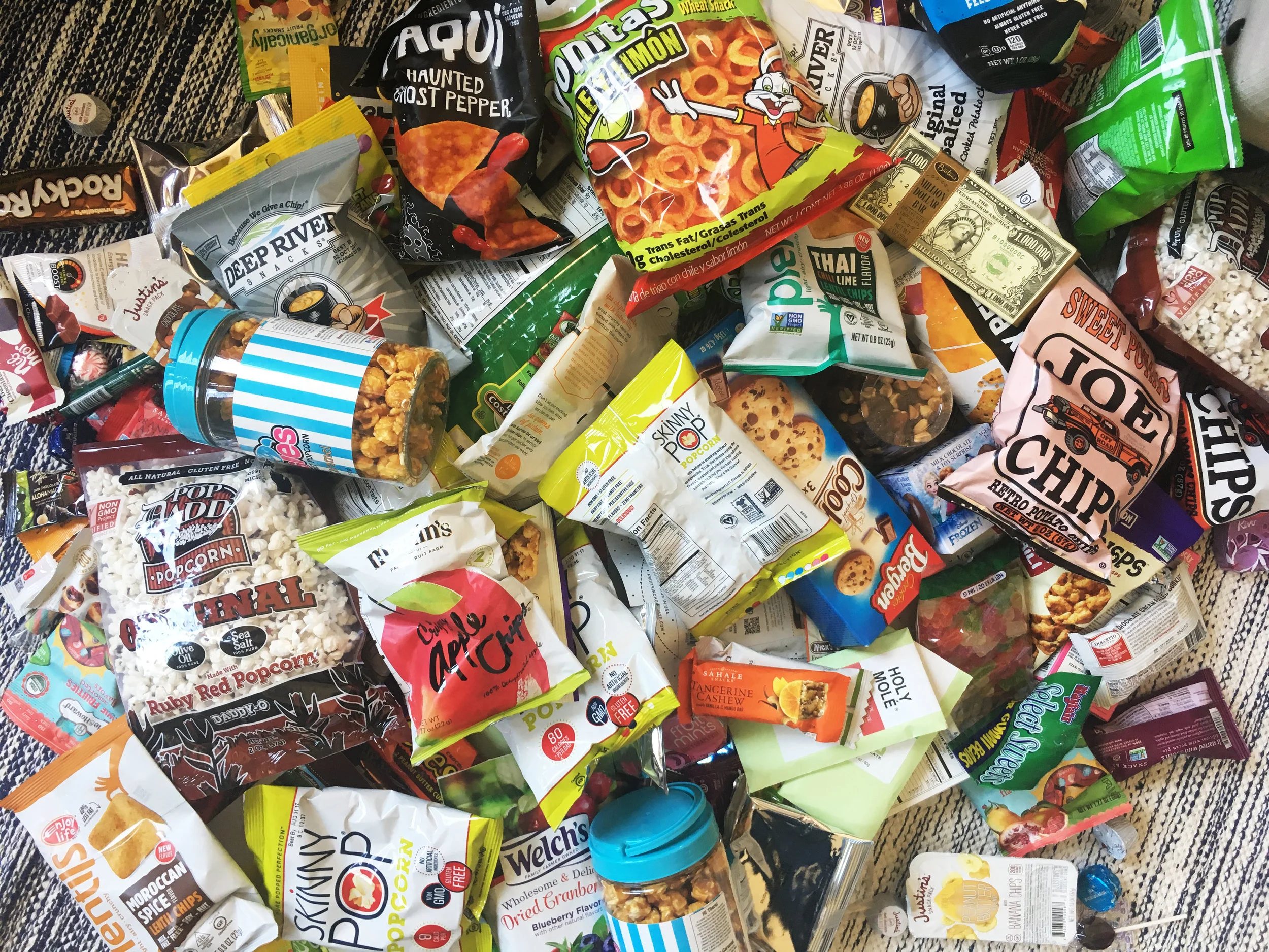
In the world of packaging, the prevailing trend seems to be "more is more," a cacophony of colors and chaos that begs the question: when did excess become the norm? The aftermath of my visit to the Chicago Sweets & Snacks Expo captures this frenzy perfectly—a visual cacophony of noise and clutter. Amidst the chaos, the Million Dollar Chocolate Bar catches my eye, not for its taste, but for its audacious branding. While it certainly stands out, I can't help but wonder: is it genuine?
One notable trend amidst the sea of vibrant hues is a welcome reduction in snack ingredients. With sugar intake a concern for many Americans, the emergence of natural fruit-infused and organic candies is a refreshing sight.
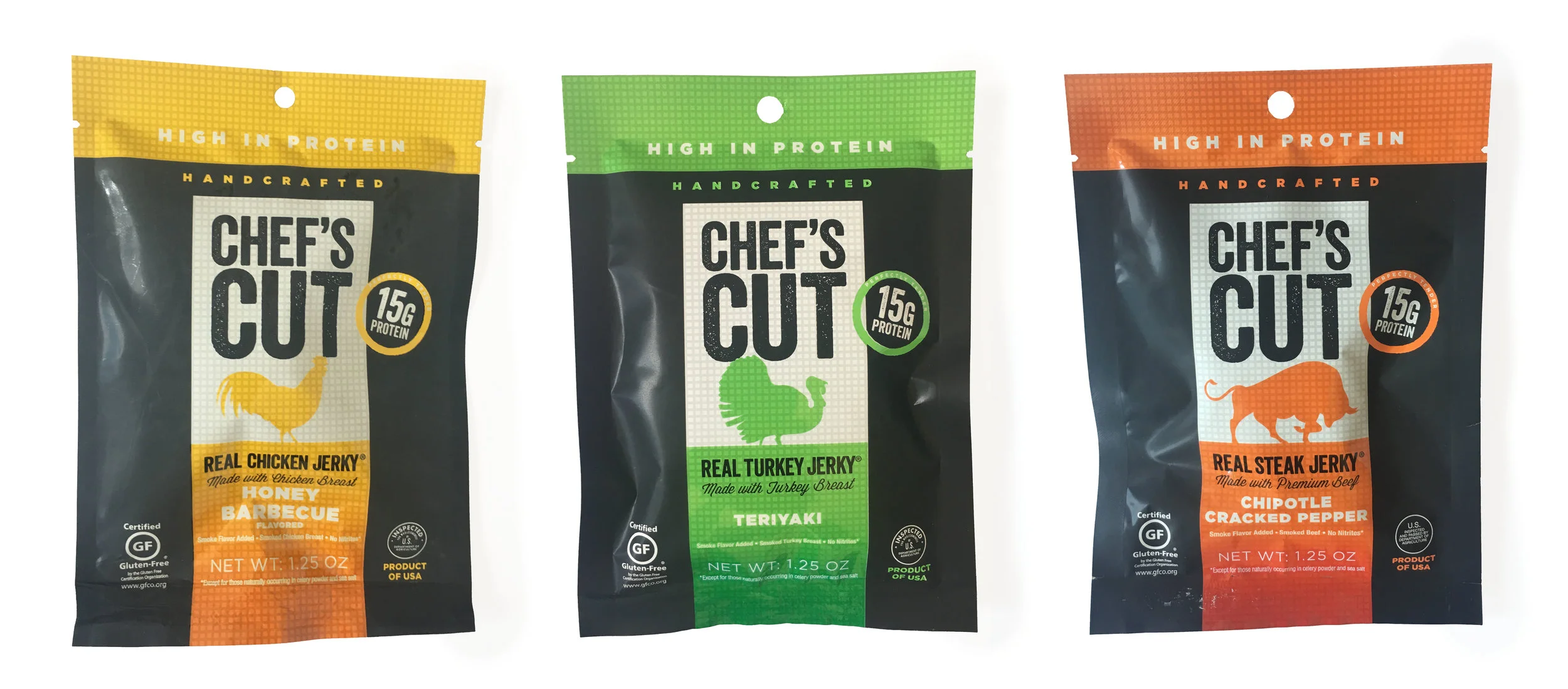
Amidst the visual noise, a few packages manage to cut through the clutter with ease. Take, for instance, Chef's Cut Jerky—a masterclass in effective hierarchy and minimalism. Its clean design allows the brand message to shine through in a matter of seconds, a critical window in today's short attention spans.

In contrast, Martin's apple chips employ a softer, more nostalgic tone, harkening back to a time of locally farmed ingredients. Hand-lettering remains a prevalent trend, adding a touch of authenticity to packaging designs.
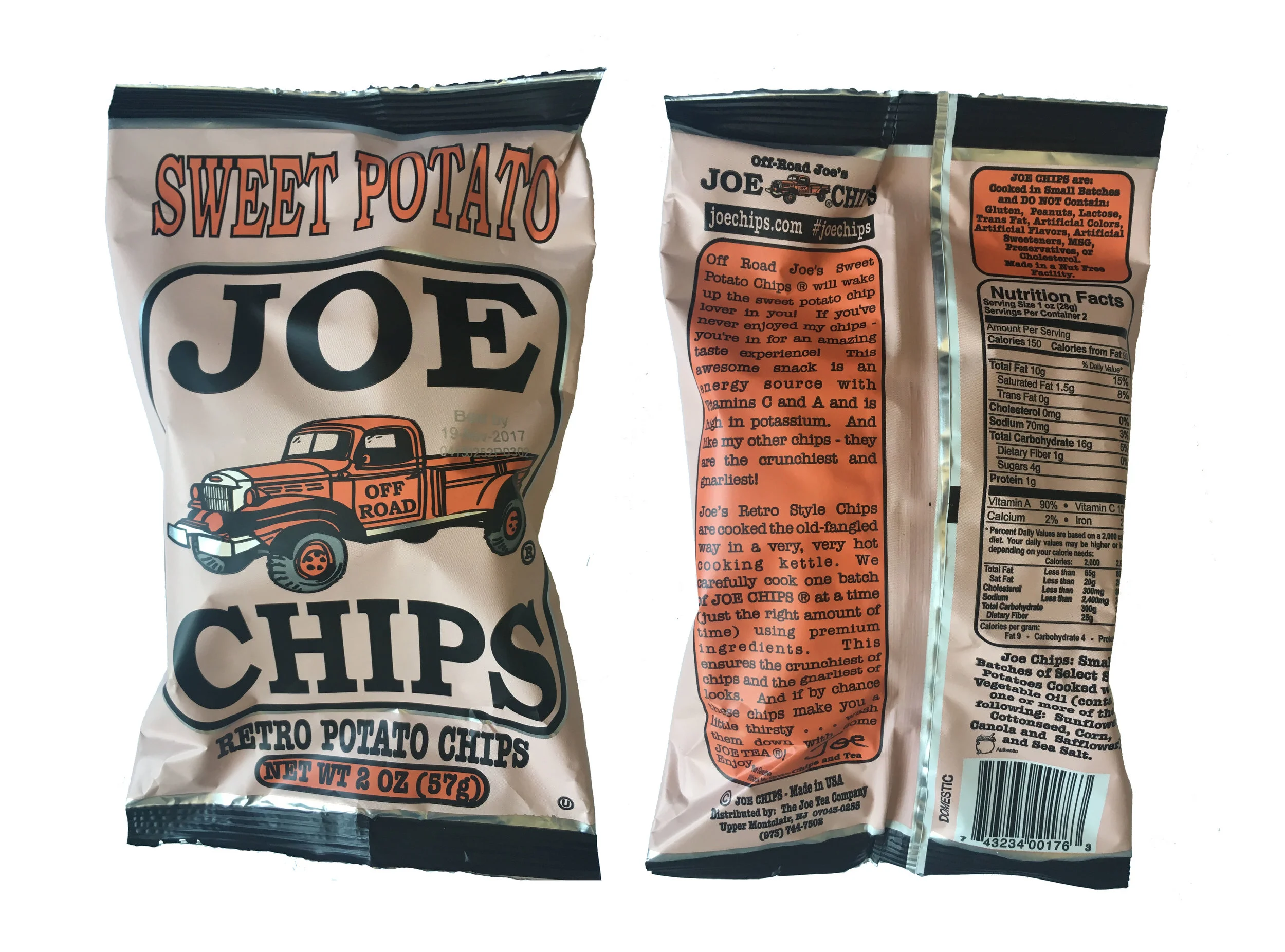
Spot gloss and foil accents are on the rise, adding a touch of luxury to otherwise mundane packages. Joe's Chips, with its vintage truck illustration and oversized block type, exudes a wholesome, nostalgic charm reminiscent of the 1950s.
Behind these successful designs lies extensive research and a commitment to authenticity. In a consumer-driven world, staying true to your brand's identity is paramount. As my mom always said, be yourself—your brand will thank you for it.


Existential Design Thoughts
I am a designer and constantly reevaluating what my niche is. Maybe it is the naive child in me, but I still believe that one can design their own career based on the crossover between their passions. I had a realization that designing for pharmaceutical companies isn't exactly why I went to art school. But, when I am designing something that I love, my life is a little closer to perfect…

As a designer, I'm constantly reflecting on where my true passions lie. Perhaps it's the idealistic child within me, but I firmly believe in shaping one's career around the intersection of their deepest interests. Designing for pharmaceutical companies, while lucrative, doesn't quite align with the artistic aspirations that led me to art school. It's when I'm immersed in projects that resonate with my soul that life feels a little closer to perfect.
This notion of intertwining passions led me to embark on a side project inspired by a simple Venn Diagram. Picture each circle representing a different aspect of your life, with one circle symbolizing your career and the others representing your various interests. Now, imagine all these circles intersecting in real life. For me, it meant melding my love for craft beer, typography, and games into a creative endeavor.
Starting with pairing favorite beers with fitting quotes, I honed my typography skills while contemplating what brew the author of each quote might enjoy. Crafting coasters for Chicago-based breweries presented an intriguing challenge—how to capture the essence of each brand while ensuring recognition?
Beyond beer, my passions extend to volleyball, blueberries, and connecting with new people. As a bartender, I discovered the art of finding common ground with every patron, illustrating the natural overlap between design and social interaction. Could this synergy pave the way for a backup career? It's a possibility, especially considering the proliferation of platforms designed to facilitate connections.
“The future belongs to those who learn more skills and combine them in creative ways.”

Crowdsourcing
Today is the day every creative hopes to never face, like every other person in the world, I am passionate about what I do for a living! Yeah 'kay, but when I DO get excited about a project it is easy to spend every minute of my day nurturing it, putting all other deadlines on the back burner and going too far down that rabbit-hole of possibilities. There aren’t too many professions where you get to make things that you really love…
Today is the day every creative hopes to never face, like every other person in the world, I am passionate about what I do for a living! Yeah 'kay, but when I DO get excited about a project it is easy to spend every minute of my day nurturing it, putting all other deadlines on the back burner and going too far down that rabbit-hole of possibilities. There aren’t too many professions where you get to make things that you really love, and I am particularly fond of branding. As a creative, I always hope for enthusiastic reactions from my clients, which can leave some room for disappointment. But, hearing that my client has turned to crowdsourcing is an entirely different level of dissatisfaction that I am hoping to cope with.
Months ago, my agency presented 12 initial logo sketches to three decision makers - I led the creative presentations, always justifying my positioning and taking note of client feedback along the way. Collectively, we quickly narrowed to three options, and eventually the winner became obvious. Too good to be true, they decided upon my favorite logo option without any Frankenstein requests?
One thing that I've learned since undergrad, is that the word final is up for interpretation when clients are referencing design.
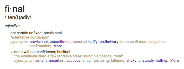
In so many words, defined by my client. (2015)
In this case, my clients decided to show the rest of their company their final logo. Our agency never got an opportunity to show our initial sketches, and the reviewing board members refused to hear positioning statements. The result was that the board members "didn't understand it". Without any warning, the client posted the logo on 99designs for crowdsourcing.
I truly hoped that upon seeing the purchased logo, I would feel okay with it. Out of 100 logos, it seemed that there could be a respectable option! Disappointment has set in, and the hilarity of the situation is that now I have been tasked with "cleaning-up" the logo that they purchased. They think it's too sharp, it's not quite symmetrical and the color just isn't right. I also get to extend their branding on all of their print collateral and redesign their website. The client was so excited about their new purchase that they even had temporary tatoos printed (before my clean-up), and were delighted to share their photo album with me after celebrating their brand launch! I am going to chalk this up to a big fat win, because: yoga.